Thursday, January 21, 2010

Illustrations

An illustration starts with a brief and a briefing. It is less about personal expression to communicate something across. It is more about satisfying a service, e.g. communicating a key message for a particular campaign to target audience. It is a direct form of visual communication.

Usually an agency who has to do a lot of illustrations , for example, a publisher, has its own illustrator. If it doesn't, it would usually hire a freelance illustrator when needed. Illustrators typically work with designers, art directors.


Illustrations are typically created for:

  • print, e.g. print ads,
  • screen, e.g. LCD screens,
  • galleries, e.g. ambience, and;
  • architectural spaces.

They appear on:

  • book covers, e.g. caricarture,
  • mags,
  • CD sleeves,
  • posters,
  • websites,
  • clothes,
  • skateboard decks,
  • etc.

An illustrator's job is to  educate, to inform, to entertain, to persuade, to give an opinion, to make a comment and to tell a story.

When an illustrator illustrates, his work must have:
  1. Clarity. It must not be vague.
  2. Vision. The illustrator should be able to visualise. All of us can visualise, it's just that we see things differently.
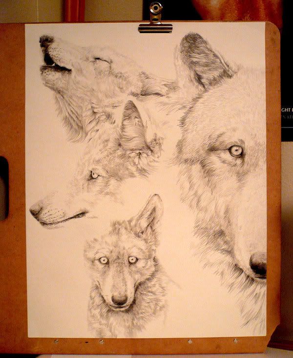
  3. Style, such that his work doesn't look like someone else's work. He should inject his own style. Sometimes an illustrator is hired because clients like his style.
  4. Personal standpoint. If he is required to make a comment/give an opinion, that's when he needs to give his take, injecting his own standpoint.

Good illustrations surprise their audience and are understood. They stay true to the idea that illustrations are anything but straightforward. Sometimes simplicity works, other times, a little complication works.

"Successful illustrators must marry excellence in practical skills with imagination (visualising skills) and intellectual rigor." - Lawrence Zeegen

Tuesday, January 19, 2010

Pencil scratches!

Since the first lesson, we've been given sketching tasks, either on our "tribal animal" or when generating ideas for ads re-designing. Sketching is an integral part in the creative process. Personally, I feel that sketches are a good way to express an idea, without consuming too much time.

In the advertising industry, there are moments where a member of a creative team has to communicate an idea to his teammates. Sketches are quick and cheap to produce. They save many hours of misdirected work. Similar to a creative brief, sketches are able to communicate ideas while reducing miscommunication, visually.

Before enrolling in DI class, I don't have the habit of sketching. However, I do like to doodle every now and then. With a designated sketchbook, it collects all ideas, concepts into one. Sketching is a good way to pen down ideas, sharpen one's drawing ability, etc. It says a lot about the sketcher.

 In a time where the Internet is dominantly used, some artists have opted for unconventional alternatives of sketching, e.g. use of social media to publish their work-in-progress, use of special materials, etc. With a personal touch, it is unique and especially appreciated.


Work-in-progress


Completed work.

Credits:  Junryou-na-Kokoro

The above images show the work-in-progress (WIP) and a completed work done in colour pencils. I used to spend hours looking at WIP of colour pencil works on deviantART. It all starts with sketches and then slowly, the artist adds in more details as he goes along. Each stroke contributes to the completion of a masterpiece. There is so much effort put in as there is so much to tell.

There is no limit as to how one can sketch. Sketching, leads to infinite possibilities.

Friday, January 15, 2010

Mascot Development: Work-In-Progress


When we were given the brief, we were told that we had to illustrate our mascots digitally. This is definitely a first! 


After reading tutorials from art forums and deviantART, I got the gist of CG. I decided I should blog about the work-in-progress for future references!


First I scanned in my sketch into the computer and penned the sketch using Pen Tool. The sketch was scanned at high resolution. It's always better to work on high resolution so that small flaws would go unnoticed when the final work is resized.


Brush size was first adjusted to 6 px before pen tool was used.


Fill in the spaces with base colours. It is okay to paint out of range. Take note as to not leave any white spaces. To tackle this, just fill a new layer with black at opacity of 30% and place it at the bottom.


For the characters to have depth, I painted shades and highlights. It is important to identify the light source such that the shadings do not look weird. Add a new layer and mark the different shades for easy reference. I painted shadows first. Highlights were left until the end.


When base colours and shadows were both painted on, I used an eraser to clean the edges.


I don't have stable hands so the edges appeared rough. I used gaussian blur to soften the shadows. Not the same adjustment levels can be used for all layers. Adjust the blurriness accordingly.


Later, when I was painting the second character. I found a new method to clean the rough edges. By using magic wand, I selected individual parts on the lineart layer. Invert the selection and press delete. Simple!


That was for painting the body. And now, the facial expression! The most important part of the face is the eyes. I used ~mew-ninjin's tutorial for the eyes.


Few more touch-ups and we're done!

Thursday, January 7, 2010

Nanyang Optical Ad

Nanyang Optical aims to reduce adverse environmental impacts and advocate corporate social responsibility. To be more effective in the recycle eye wear project, the company has developed the full circle recycling system.


Based on hip looks of its products, its targeted consumers are young adult shoppers. For this Christmas promotion, it is aiming Christmas shoppers within this demographic group. It is especially targeted to people who are in need of changing spectacles within the promotion period as spectacles are commonly renewed only once a year. They should be existing spectacles wearer and are in tune with spectacle prices.


The medium used would be newspaper. The image has to be eye-catching and has stopping power. 


I visualised a Santa Claus without spectacles. And with a brand new pair of spectacles, it'd be "the season to see clearly" for Santa.


I did a search on iStockPhoto and found an image that fits the theme. I decided to include a broken pair of spectacles to represent Santa's broken spectacles.


This was one of my first drafts.


The feedback I got back from my friends was that:

  1. The broken spectacles didn't fit the image well.
  2. The colours of the image and the background did not blend.
And personally, I thought the type didn't fit as well. It was too cutesy and colourful.

I replaced the broken spectacles with another pair and changed the font to something more formal. I also used the same font and style throughout. I asked my friends for their opinions again.

This time, they thought the advertisement did have the stopping power. One of my friend thought it would look better without the broken spectacles, but I thought I'd make it stay.

After a few amendments and adjustments, this is the final poster!