Monday, February 15, 2010

National Museum of Singapore


For the last lesson of Design and Illustration module, we went on a field trip to the National Museum of Singapore. This is the first time I've ever been to the museum. It was definitely a fruitful trip!


We were given a guided tour by Ms. Janice Montgomery, a volunteer of the museum. With her guiding us, the tour was an insightful one. First, she brought us to the entrance of the museum. Here, we were given an introduction of the museum.


The museum's history dates back to 1849 when it was started as a section of a library at Singapore Institution. The museum now serves as a tribute to the scientists and people of the Victorian time. 


The most prominent structure within the rotunda is the dome. There are 50 stained glass panels on the dome as to celebrate the Queen's Golden Jubilee year. The flower motif designs were to resemble the European style.


The building was closed in April 2003 for extension and restoration works. And here it says, the reopening was officiated by the Singapore President, S. R. Nathan.


From the photo, we can see a column with Corinthian capital on the left and an arch on the right. The keystone in the middle of the arch supports the structure. The keystone has to be positioned precisely such that it can withstand gravitational pull and also pressure from the ceiling.


Roman-styled arches and a column with a Doric capital.


The balustrades (metal railings).


The Singapore Living Gallery was designed to be interactive, incorporating both sound and visual. The first section tells stories of Singapore cuisine, and what it was like back then. The living gallery features local cuisine such as roti prata, laksa, kueh tutu and more. 


The second section of the gallery features various spices that are commonly used in local cuisines. This also tells tales of the past as countries within the region, including Singapore have been an important source of spices and this was one of the reasons the European explorers were attracted here.


The galleries set scenes and atmosphere of the historic time, of the war, the education and the lifestyle. All of these are done with audio and visuals.


Traditional molds used to make kueh (pastries)


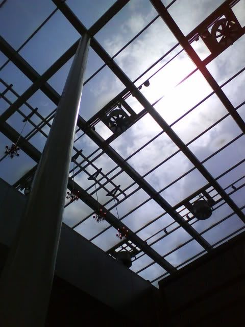
A six-metre passage exists between the back of the main museum building and its new annex in accordance to the conservation guidelines. The passage contains self supporting glass panels. Optical glass panels are used such that visitors are able to see the dome from within, as opposed to standing across Stanford Road to see it. 


This is one of the commissioned artworks. The chandeliers are 1.5m tall each. Chandeliers are a representation of the European time. Red is an Asian colour and the artwork was meant to symbolise a blend of Western and Eastern culture.


The new annex was mirrored and it replicated the old building. The old building is still very much restored to its original state. The new annex, however, was built to replace the destroyed back facade. Glass panels are used to open up the space.


The dome in the new annex is cylindrical. It is a modern integration of the old dome. The glass panels can project images at anytime of the day.


Earthy colours are used on the walls to give a feeling that the new annex was excavated from the old building.


After the trip, I felt that much thought were put in to incorporate the old and new building. Every little thing within the museum tells a tale of its own. Each brings its own meaning. Modernism and classicism were integrated to remind its people of the past. Although I'm not a local, I think it is still relevant as I've studied South East Asia histories. It is quite similar to my country's history. This is especially true when my hometown, Penang Island, like Singapore, was once used as a port. These two islands have so much in common.


Thursday, February 11, 2010

Threadless Tee

I first started off with a few sketches, each with a different idea in mind. I asked a few of my friends if they liked it. 2 out of 3 liked the sketch of my final work. I decided to work upon that sketch!

The puppy looked shy, as to portray his reluctance. He was aware of their differences. On the other hand, the kitty looked delighted, as if she was ready to accept the puppy. The idea was to portray that love transcends all boundaries.


I've chosen to draw my usual chibi-styled characters to give it a sweet feeling.


I submitted the design to Threadless and I was rated 1.73 out of 5! This gives a gauge on how much the design reaches the audience. And based on the comments, I know that the right message was sent across. Some minor changes were needed to make it even better.


Here's the design!


Thursday, January 21, 2010

Illustrations

An illustration starts with a brief and a briefing. It is less about personal expression to communicate something across. It is more about satisfying a service, e.g. communicating a key message for a particular campaign to target audience. It is a direct form of visual communication.

Usually an agency who has to do a lot of illustrations , for example, a publisher, has its own illustrator. If it doesn't, it would usually hire a freelance illustrator when needed. Illustrators typically work with designers, art directors.


Illustrations are typically created for:

  • print, e.g. print ads,
  • screen, e.g. LCD screens,
  • galleries, e.g. ambience, and;
  • architectural spaces.

They appear on:

  • book covers, e.g. caricarture,
  • mags,
  • CD sleeves,
  • posters,
  • websites,
  • clothes,
  • skateboard decks,
  • etc.

An illustrator's job is to  educate, to inform, to entertain, to persuade, to give an opinion, to make a comment and to tell a story.

When an illustrator illustrates, his work must have:
  1. Clarity. It must not be vague.
  2. Vision. The illustrator should be able to visualise. All of us can visualise, it's just that we see things differently.
  3. Style, such that his work doesn't look like someone else's work. He should inject his own style. Sometimes an illustrator is hired because clients like his style.
  4. Personal standpoint. If he is required to make a comment/give an opinion, that's when he needs to give his take, injecting his own standpoint.

Good illustrations surprise their audience and are understood. They stay true to the idea that illustrations are anything but straightforward. Sometimes simplicity works, other times, a little complication works.

"Successful illustrators must marry excellence in practical skills with imagination (visualising skills) and intellectual rigor." - Lawrence Zeegen

Tuesday, January 19, 2010

Pencil scratches!

Since the first lesson, we've been given sketching tasks, either on our "tribal animal" or when generating ideas for ads re-designing. Sketching is an integral part in the creative process. Personally, I feel that sketches are a good way to express an idea, without consuming too much time.

In the advertising industry, there are moments where a member of a creative team has to communicate an idea to his teammates. Sketches are quick and cheap to produce. They save many hours of misdirected work. Similar to a creative brief, sketches are able to communicate ideas while reducing miscommunication, visually.

Before enrolling in DI class, I don't have the habit of sketching. However, I do like to doodle every now and then. With a designated sketchbook, it collects all ideas, concepts into one. Sketching is a good way to pen down ideas, sharpen one's drawing ability, etc. It says a lot about the sketcher.

 In a time where the Internet is dominantly used, some artists have opted for unconventional alternatives of sketching, e.g. use of social media to publish their work-in-progress, use of special materials, etc. With a personal touch, it is unique and especially appreciated.


Work-in-progress


Completed work.

Credits:  Junryou-na-Kokoro

The above images show the work-in-progress (WIP) and a completed work done in colour pencils. I used to spend hours looking at WIP of colour pencil works on deviantART. It all starts with sketches and then slowly, the artist adds in more details as he goes along. Each stroke contributes to the completion of a masterpiece. There is so much effort put in as there is so much to tell.

There is no limit as to how one can sketch. Sketching, leads to infinite possibilities.

Friday, January 15, 2010

Mascot Development: Work-In-Progress


When we were given the brief, we were told that we had to illustrate our mascots digitally. This is definitely a first! 


After reading tutorials from art forums and deviantART, I got the gist of CG. I decided I should blog about the work-in-progress for future references!


First I scanned in my sketch into the computer and penned the sketch using Pen Tool. The sketch was scanned at high resolution. It's always better to work on high resolution so that small flaws would go unnoticed when the final work is resized.


Brush size was first adjusted to 6 px before pen tool was used.


Fill in the spaces with base colours. It is okay to paint out of range. Take note as to not leave any white spaces. To tackle this, just fill a new layer with black at opacity of 30% and place it at the bottom.


For the characters to have depth, I painted shades and highlights. It is important to identify the light source such that the shadings do not look weird. Add a new layer and mark the different shades for easy reference. I painted shadows first. Highlights were left until the end.


When base colours and shadows were both painted on, I used an eraser to clean the edges.


I don't have stable hands so the edges appeared rough. I used gaussian blur to soften the shadows. Not the same adjustment levels can be used for all layers. Adjust the blurriness accordingly.


Later, when I was painting the second character. I found a new method to clean the rough edges. By using magic wand, I selected individual parts on the lineart layer. Invert the selection and press delete. Simple!


That was for painting the body. And now, the facial expression! The most important part of the face is the eyes. I used ~mew-ninjin's tutorial for the eyes.


Few more touch-ups and we're done!

Thursday, January 7, 2010

Nanyang Optical Ad

Nanyang Optical aims to reduce adverse environmental impacts and advocate corporate social responsibility. To be more effective in the recycle eye wear project, the company has developed the full circle recycling system.


Based on hip looks of its products, its targeted consumers are young adult shoppers. For this Christmas promotion, it is aiming Christmas shoppers within this demographic group. It is especially targeted to people who are in need of changing spectacles within the promotion period as spectacles are commonly renewed only once a year. They should be existing spectacles wearer and are in tune with spectacle prices.


The medium used would be newspaper. The image has to be eye-catching and has stopping power. 


I visualised a Santa Claus without spectacles. And with a brand new pair of spectacles, it'd be "the season to see clearly" for Santa.


I did a search on iStockPhoto and found an image that fits the theme. I decided to include a broken pair of spectacles to represent Santa's broken spectacles.


This was one of my first drafts.


The feedback I got back from my friends was that:

  1. The broken spectacles didn't fit the image well.
  2. The colours of the image and the background did not blend.
And personally, I thought the type didn't fit as well. It was too cutesy and colourful.

I replaced the broken spectacles with another pair and changed the font to something more formal. I also used the same font and style throughout. I asked my friends for their opinions again.

This time, they thought the advertisement did have the stopping power. One of my friend thought it would look better without the broken spectacles, but I thought I'd make it stay.

After a few amendments and adjustments, this is the final poster!


Tuesday, December 29, 2009

Good Ads? Bad Ads?

In week 7, we were taught the characteristics of a good ad and how an ad can appeal to its target audience.

Target Audience
Rule of thumb, as always, know your audience.
  1. Tolerate - Know what your audience can/cannot tolerate. E.g. children (TA) are intolerable of gory pictures.
  2. Distasteful - Tastefulness is subjective. It varies from culture to culture.
  3. Limits - Advertising ethics are taken into consideration.
  4. Cool factor - Does it appear to be "cool" to your TA?
  5. Humour, culture and frame of reference - Frame of reference is the association with something, e.g. the use of blue colour is associated to masculinity. Humour and frame of reference differs from culture to culture.
Bottomline, respect your audience. Don't underestimate them but do understand them. They are what your company represents.


"I AM AN AD!"
While walking down the street, sometimes you see ads that scream "I AM AN AD!". More often than not, this type of ad doesn't work. It may work sometimes, e.g. for ads with the product as the main visual.


  • The product is the main visual.
  • The company logo.
  • A formulaic layout that is used by millions of others.
  • The copy sounds like a sales pitch.

A Typical Ad Layout
The layout of a typical ad usually looks like a visual sales pitch, e.g.


The product is obvious and the ad is not visually unified. So what is meantby unified visuals? Meaning, the image and the typography don't work together to bring the same message. As we all know, it is important a consistent message is sent to target audience for maximum effects.

Also, the ad has little visual impact and it is not memerable. There is no visual surprise and it is boring.

An Atypical Ad Layout That Just Works Better
On the other hand, some ads just work better. Why? I'll explain.

The ad is visually surprising and engaging. It stops an audience on his way (remember "Huh?" in SHRED?). It makes the audience remember the ad message.

The ad is seductive as it creates emotions and feelings within you, e.g. a likeable feeling. The idea is fresh such that it is motivating to read. People would pause to absorb the message. Most of all, it is worthy of being hung on the wall.


8 Design Pointers
Of course, design an atypical ad is not easy. However, there're some design pointers we can always follow.

  1. Be daring when creating contrast. E.g. big visual, small type (or vice versa).
  2. The line breaks of type follow speech pattern.
  3. Line breaks slow down communication which is why- refer to point no. 2.
  4. Resist the usual - because good ads are fresh, visually surprising and engaging.
  5. Create a visual hierarchy. Consider which element is more important.
  6. Avoid visual clutter.
  7. Create visual interest. It helps when the image is interesting.
  8. The ad entertains visually.


As usual, we were given a design task! This week, we were given a corporate and we were supposed to redesign it.

First off, we analyzed and identified the target audience. There are also things that were taken into account:
  • Background of the clients (organizations).
  • Culture of the organizations.
  • What they do.
  • What they are famous for.
In the end, we targeted the key decision-makers of the clients (TA) who are the people in the marketing department.

For the ad to appeal to the TA, the TA have to feel good about the ad and make known to them what they can use.

And there we go, I've come up with this!