Target Audience
Rule of thumb, as always, know your audience.
- Tolerate - Know what your audience can/cannot tolerate. E.g. children (TA) are intolerable of gory pictures.
- Distasteful - Tastefulness is subjective. It varies from culture to culture.
- Limits - Advertising ethics are taken into consideration.
- Cool factor - Does it appear to be "cool" to your TA?
- Humour, culture and frame of reference - Frame of reference is the association with something, e.g. the use of blue colour is associated to masculinity. Humour and frame of reference differs from culture to culture.
"I AM AN AD!"
While walking down the street, sometimes you see ads that scream "I AM AN AD!". More often than not, this type of ad doesn't work. It may work sometimes, e.g. for ads with the product as the main visual.

"I AM AN AD!"
Credits: http://www.premiercomsolutions.com/yahoo_site_admin/assets/images/Sales_Ad.190130901_std.jpg
- The product is the main visual.
- The company logo.
- A formulaic layout that is used by millions of others.
- The copy sounds like a sales pitch.
A Typical Ad Layout
The layout of a typical ad usually looks like a visual sales pitch, e.g.
The product is obvious and the ad is not visually unified. So what is meantby unified visuals? Meaning, the image and the typography don't work together to bring the same message. As we all know, it is important a consistent message is sent to target audience for maximum effects.
Also, the ad has little visual impact and it is not memerable. There is no visual surprise and it is boring.
An Atypical Ad Layout That Just Works Better
On the other hand, some ads just work better. Why? I'll explain.
The ad is visually surprising and engaging. It stops an audience on his way (remember "Huh?" in SHRED?). It makes the audience remember the ad message.
The ad is seductive as it creates emotions and feelings within you, e.g. a likeable feeling. The idea is fresh such that it is motivating to read. People would pause to absorb the message. Most of all, it is worthy of being hung on the wall.
8 Design Pointers
Of course, design an atypical ad is not easy. However, there're some design pointers we can always follow.
- Be daring when creating contrast. E.g. big visual, small type (or vice versa).
- The line breaks of type follow speech pattern.
- Line breaks slow down communication which is why- refer to point no. 2.
- Resist the usual - because good ads are fresh, visually surprising and engaging.
- Create a visual hierarchy. Consider which element is more important.
- Avoid visual clutter.
- Create visual interest. It helps when the image is interesting.
- The ad entertains visually.
As usual, we were given a design task! This week, we were given a corporate and we were supposed to redesign it.
First off, we analyzed and identified the target audience. There are also things that were taken into account:
- Background of the clients (organizations).
- Culture of the organizations.
- What they do.
- What they are famous for.
For the ad to appeal to the TA, the TA have to feel good about the ad and make known to them what they can use.
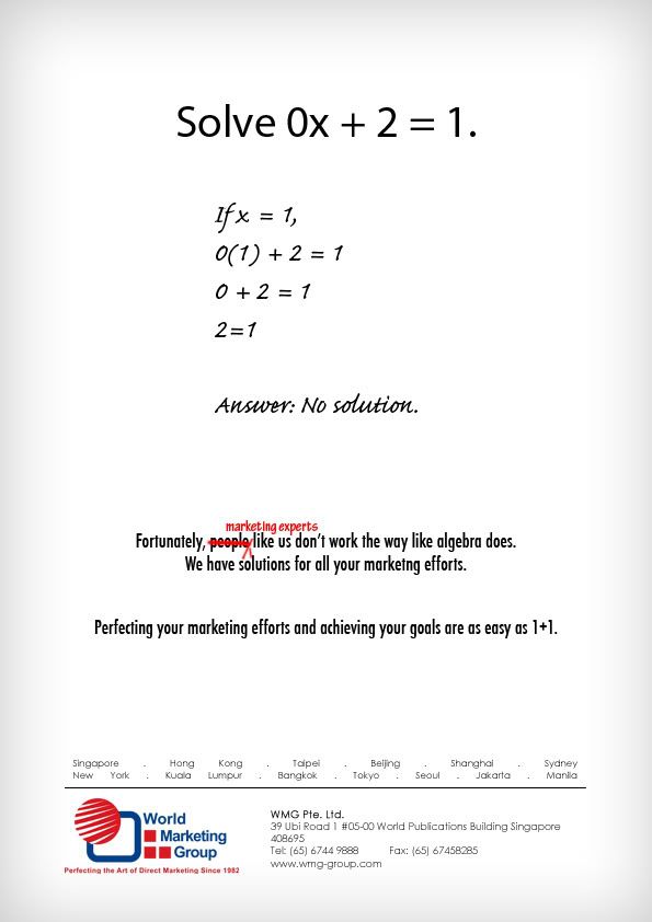
And there we go, I've come up with this!

